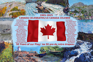
The blue colour that was selected to set off the flag and the all important lettering is the “glue” that holds the 50 Years of Our Flag Painting together. Blue is not one of the official colours of Canada. The red and white used on the maple leaf flag were given to Canada in 1921 by King George V as the official colours. This shade of blue is most attractive with Canada’s colours but more importantly it allowed me to seamlessly flow the lettering background into the skies, the water, the snow and even the rocks of the supporting Canadian scenes that make up the fabric of our culture and heritage. It is a unifying colour and the selection of this pigment was certainly not by chance. Note that it is not the same blue as used in Pearson’s Pennant… but that is another story.
A good friend and great artist Aleta Karstad was viewing the final draft of the painting (shown) as approved by John Ross Matheson and Bob Harper and made the following observation: “I think the edge of the pale blue background to the lettering is too abrupt. It makes a rectangle right in the middle of the painting.” Aleta offered some other excellent suggestions as well.
I couldn’t have agreed more with Aleta and in turning the draft into the final painting I have been grappling with these artistic issues on a daily basis. We had come to the same artistic destination separately. It is reassuring that other artists feel the same way as I did when I first started applying pigment to canvas six months ago. As I continue to paint and approach the completion of the artwork I also continue to improve on these solutions – thanks Aleta!

No comments:
Post a Comment